Fiserv

Integrated Payments for ISVs

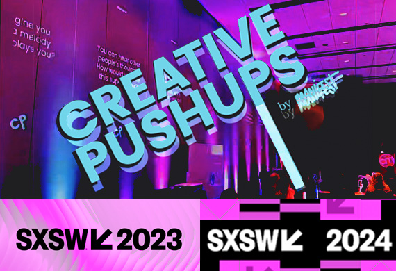
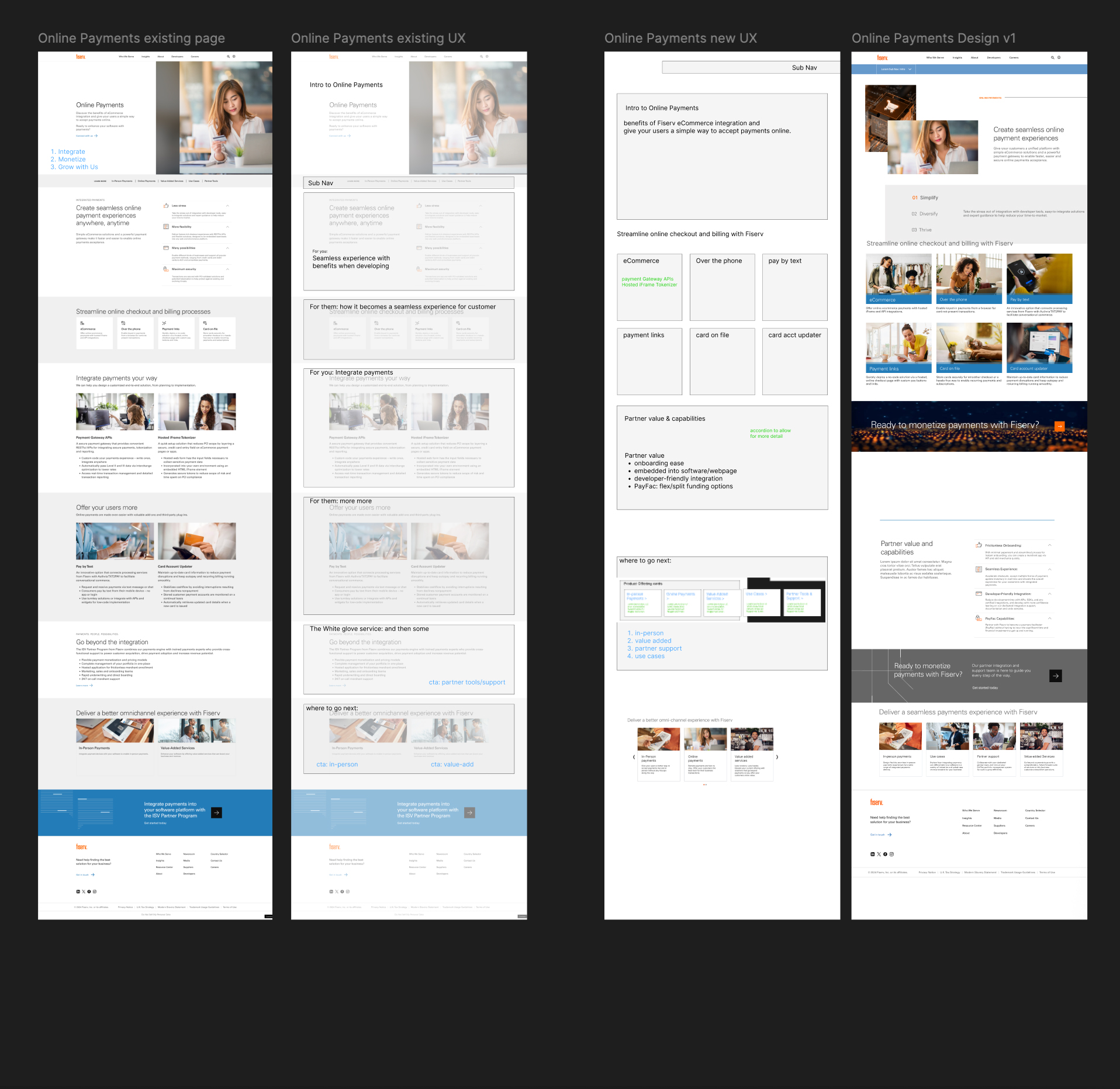
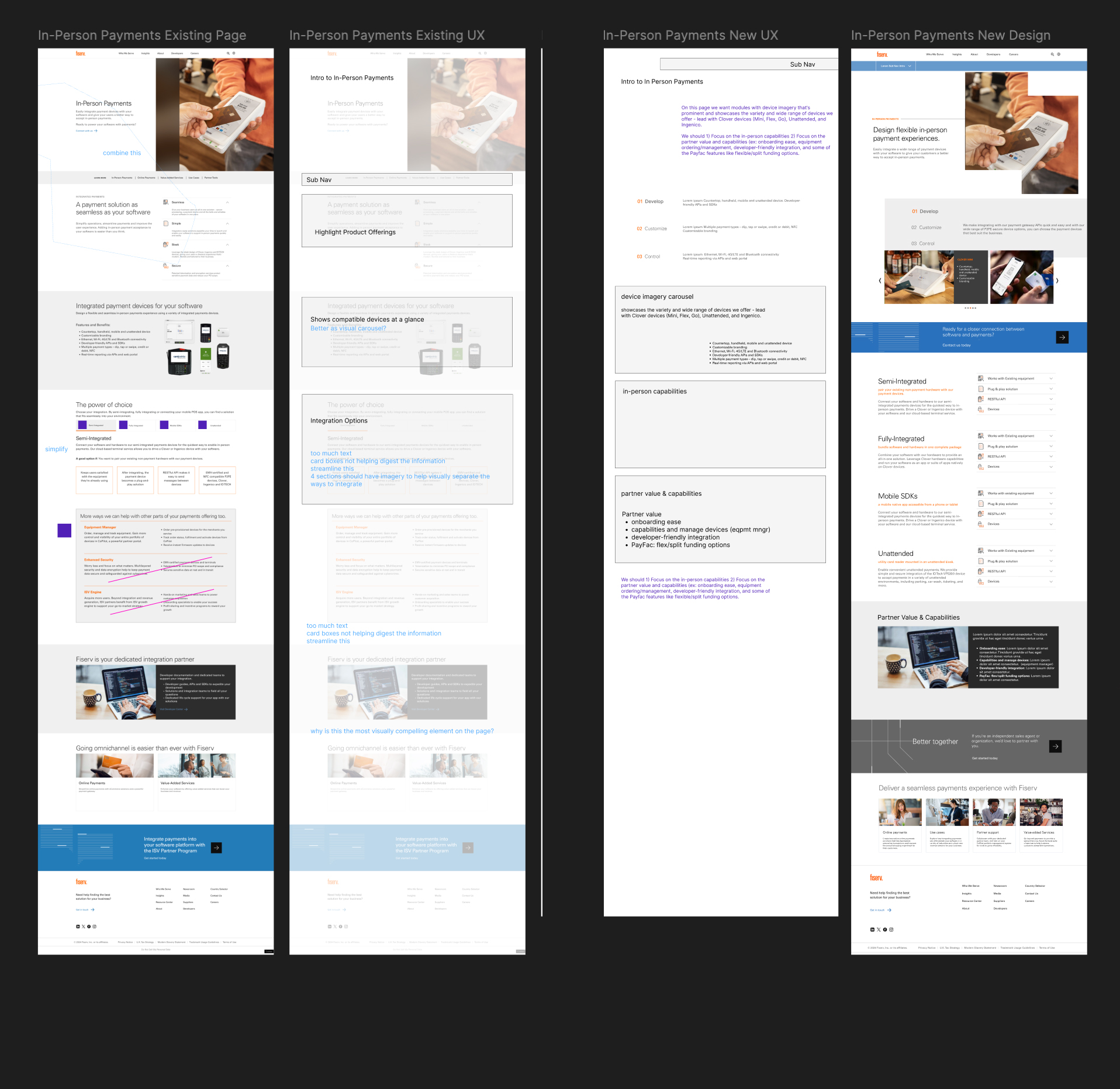
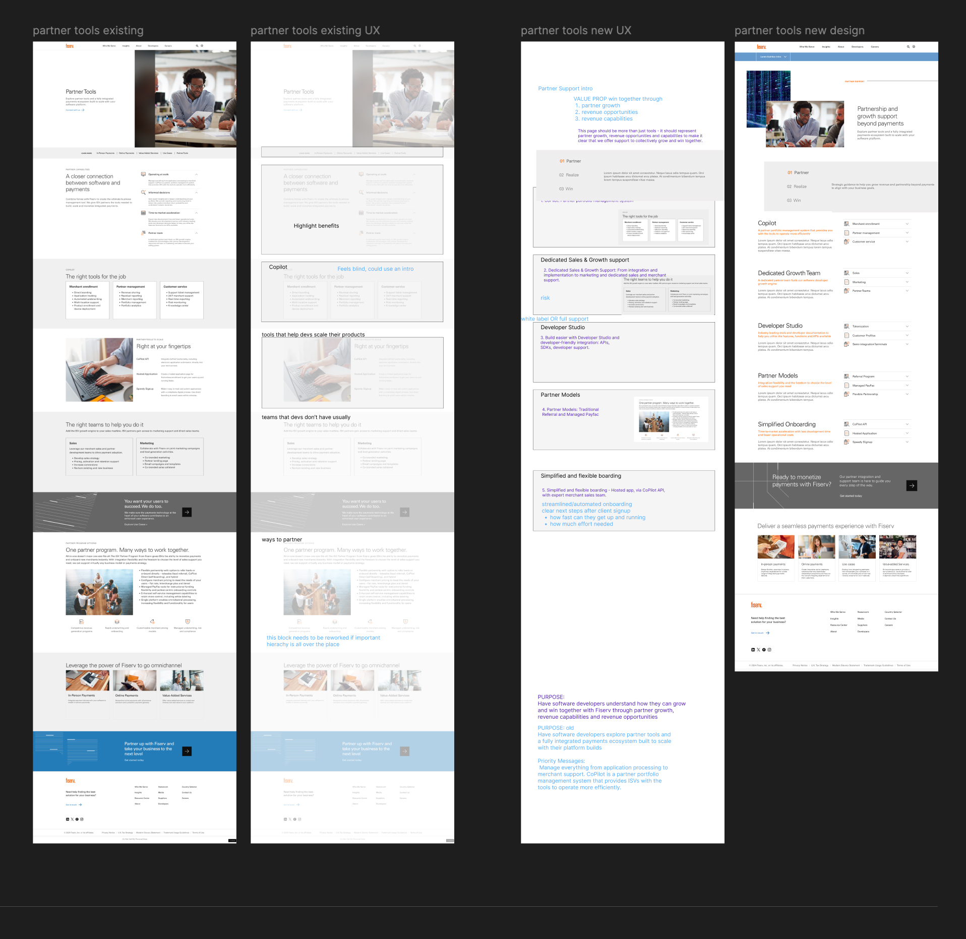
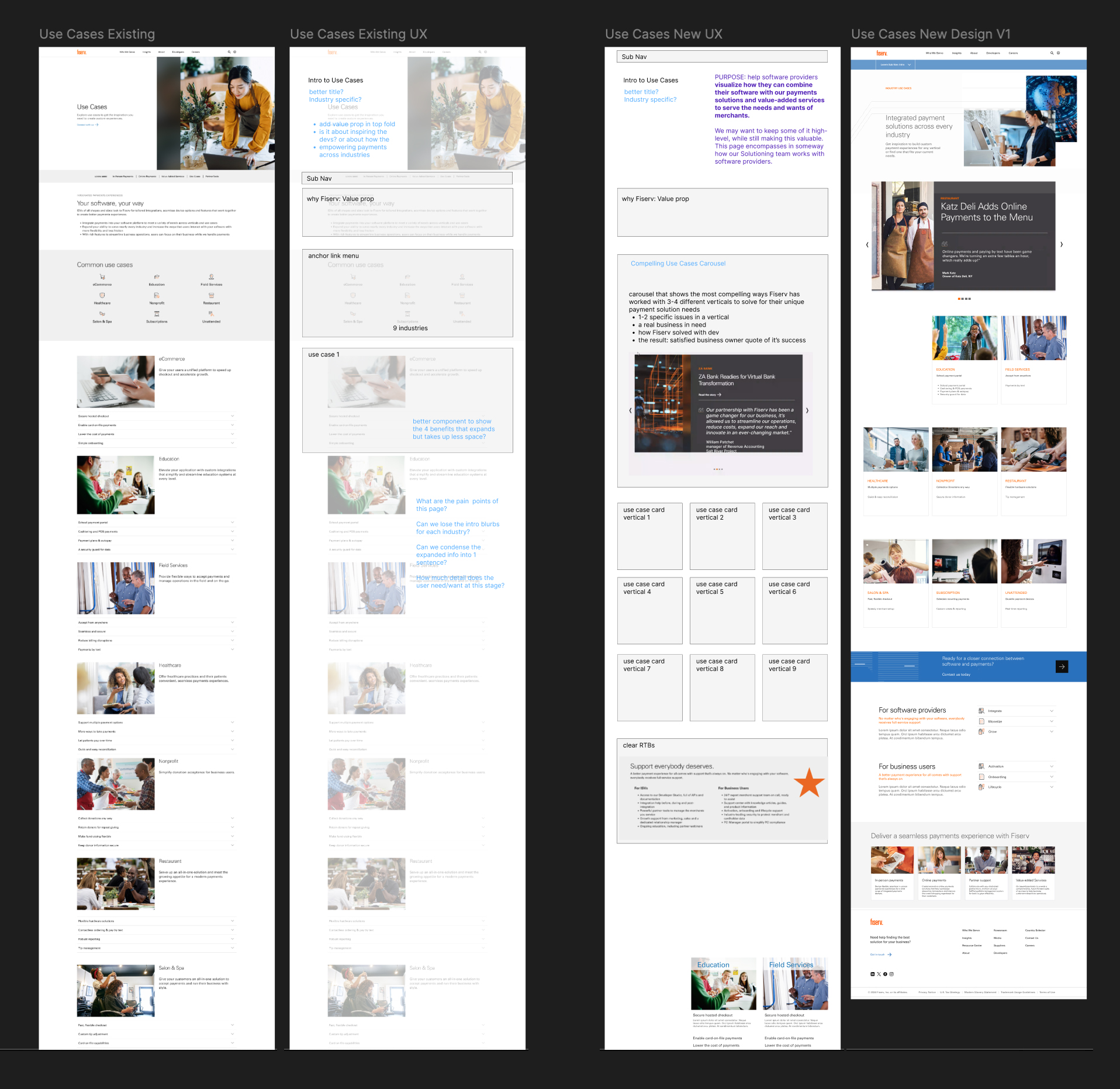
How do you redesign a microsite for a very specific B2B target audience in 3 weeks in time for the conference? Dive in fast.

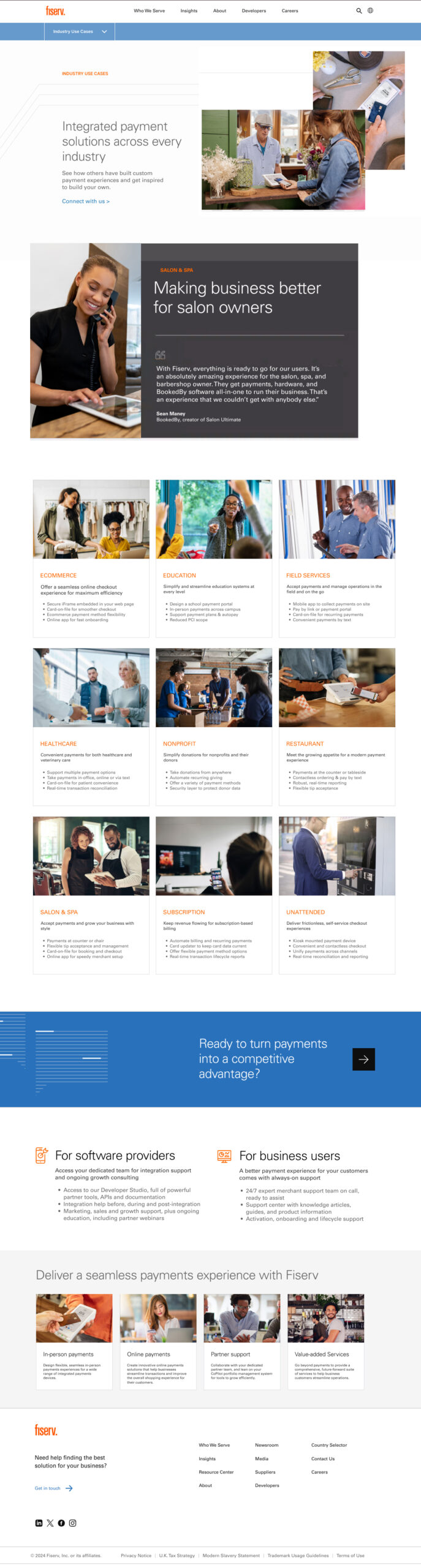
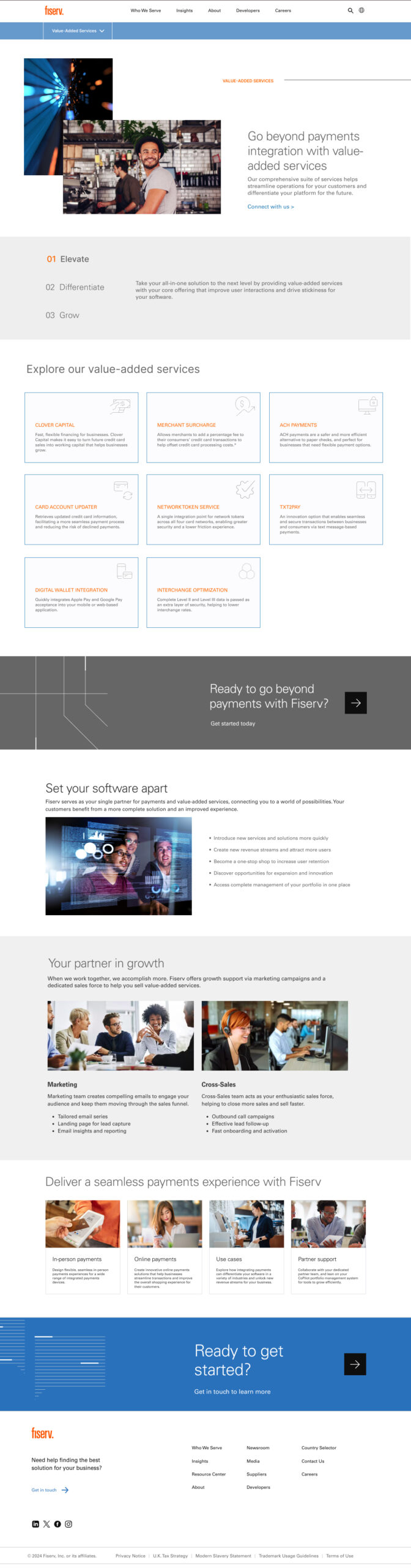
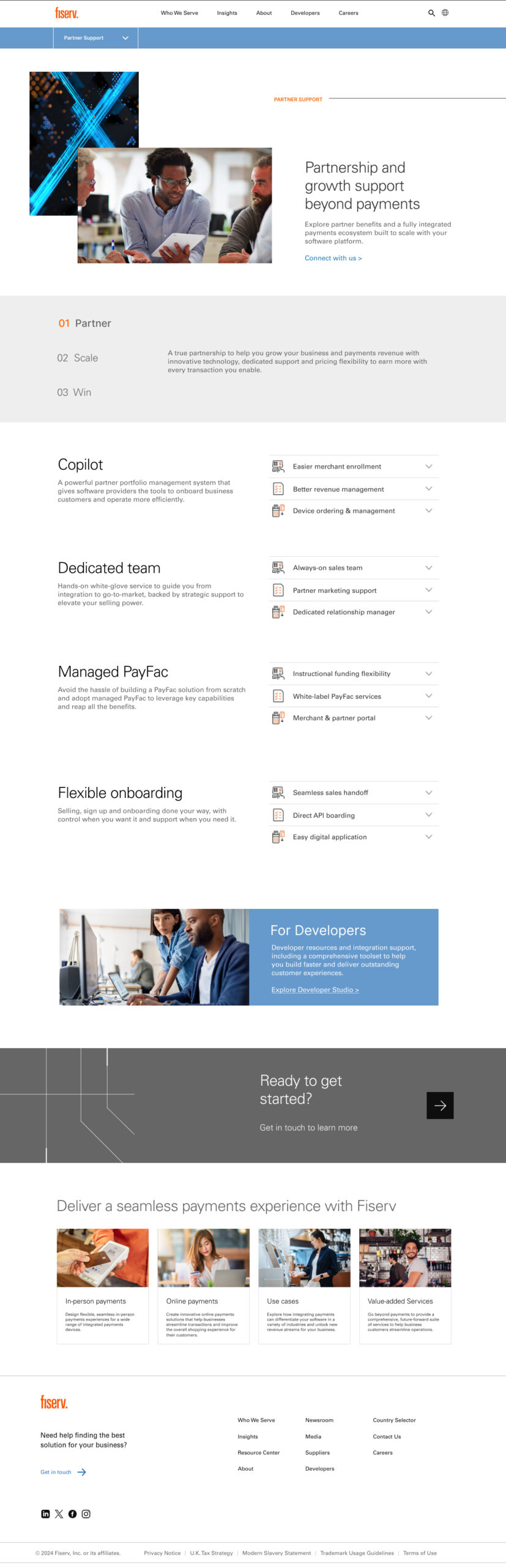
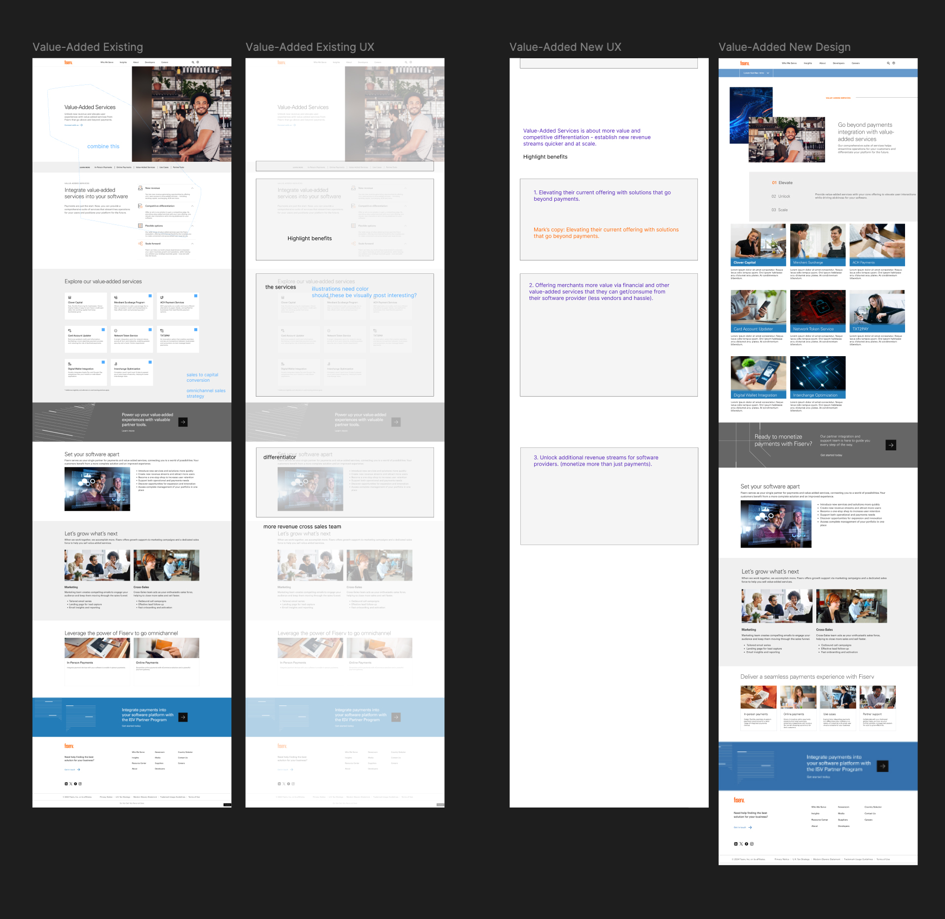
Fiserv approached us to help get them out of a jam. They needed their microsite for Independent Software Vendors (ISVs) revamped in time for their upcoming conference. The current pages were not organized in a way that spoke to their target and they were losing opportunities to their competitors.

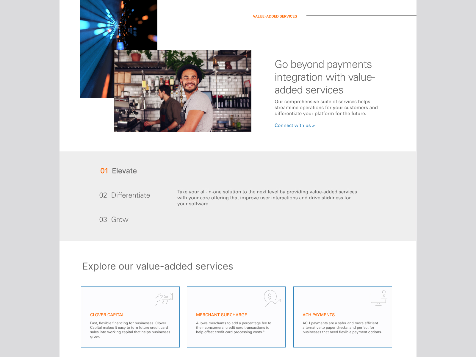
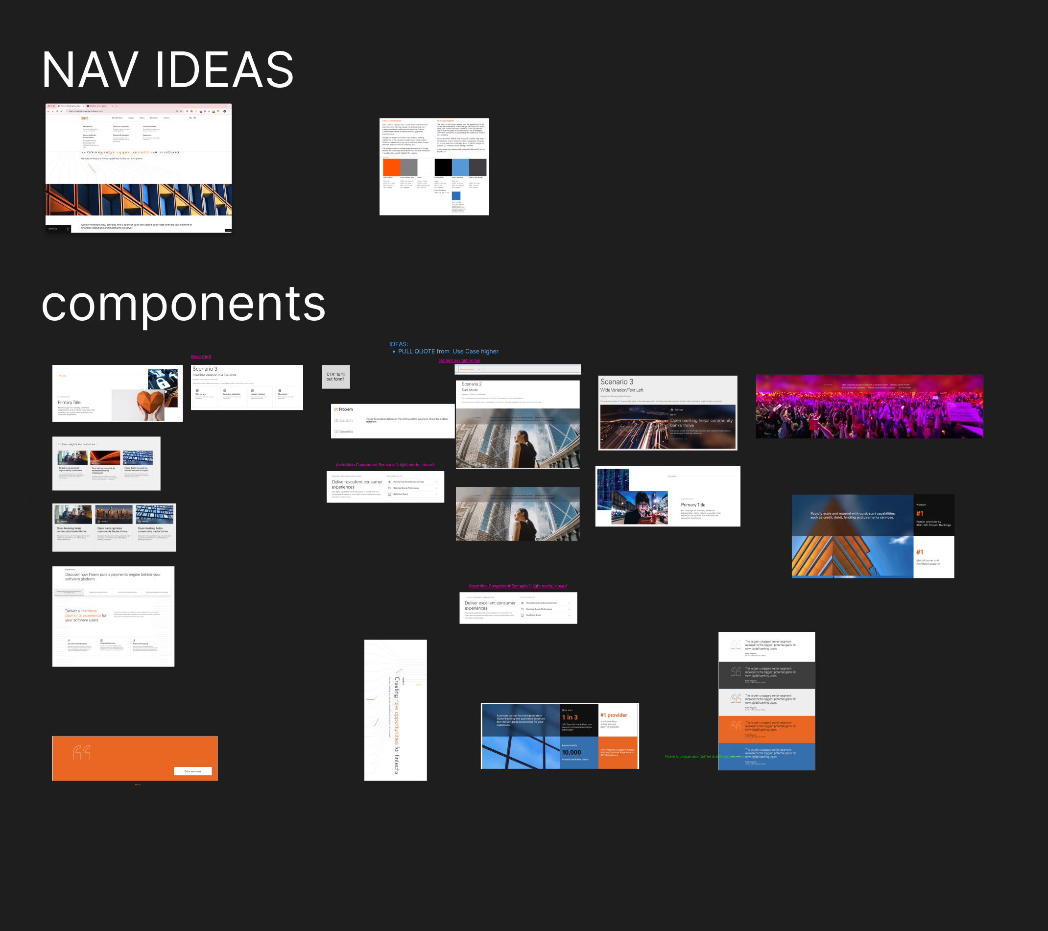
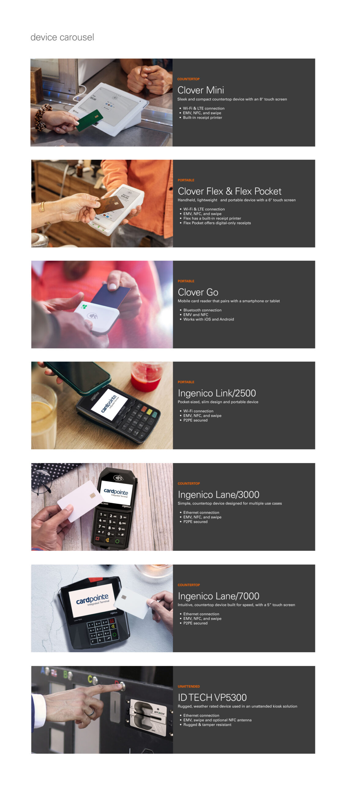
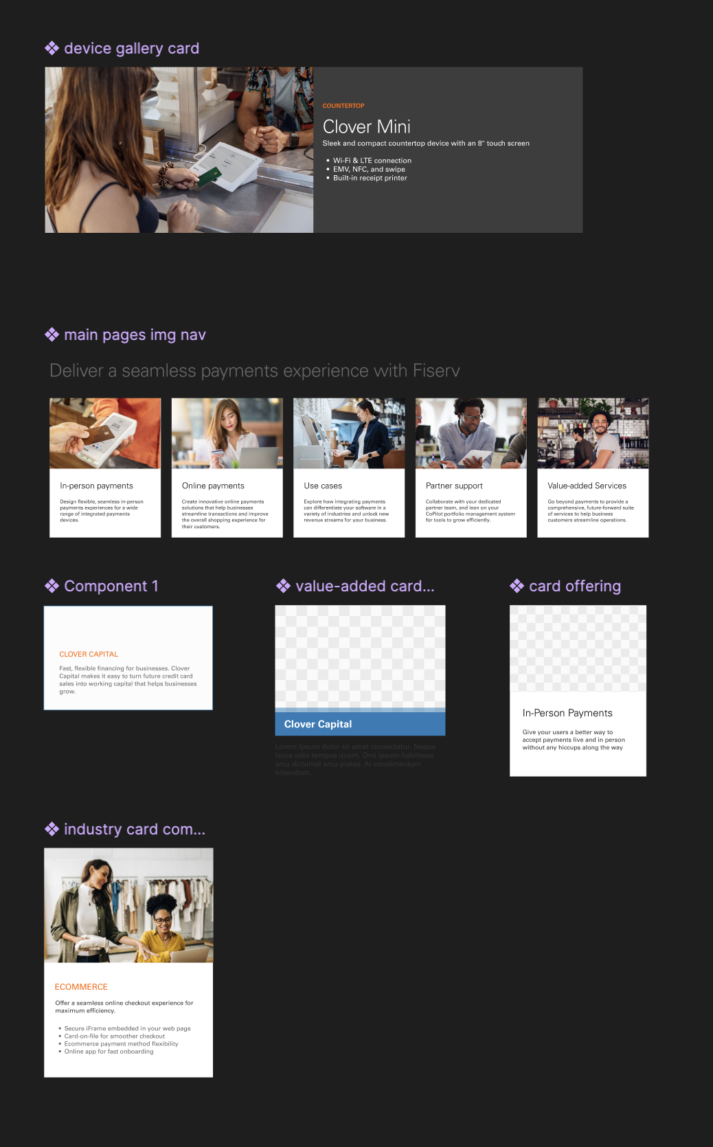
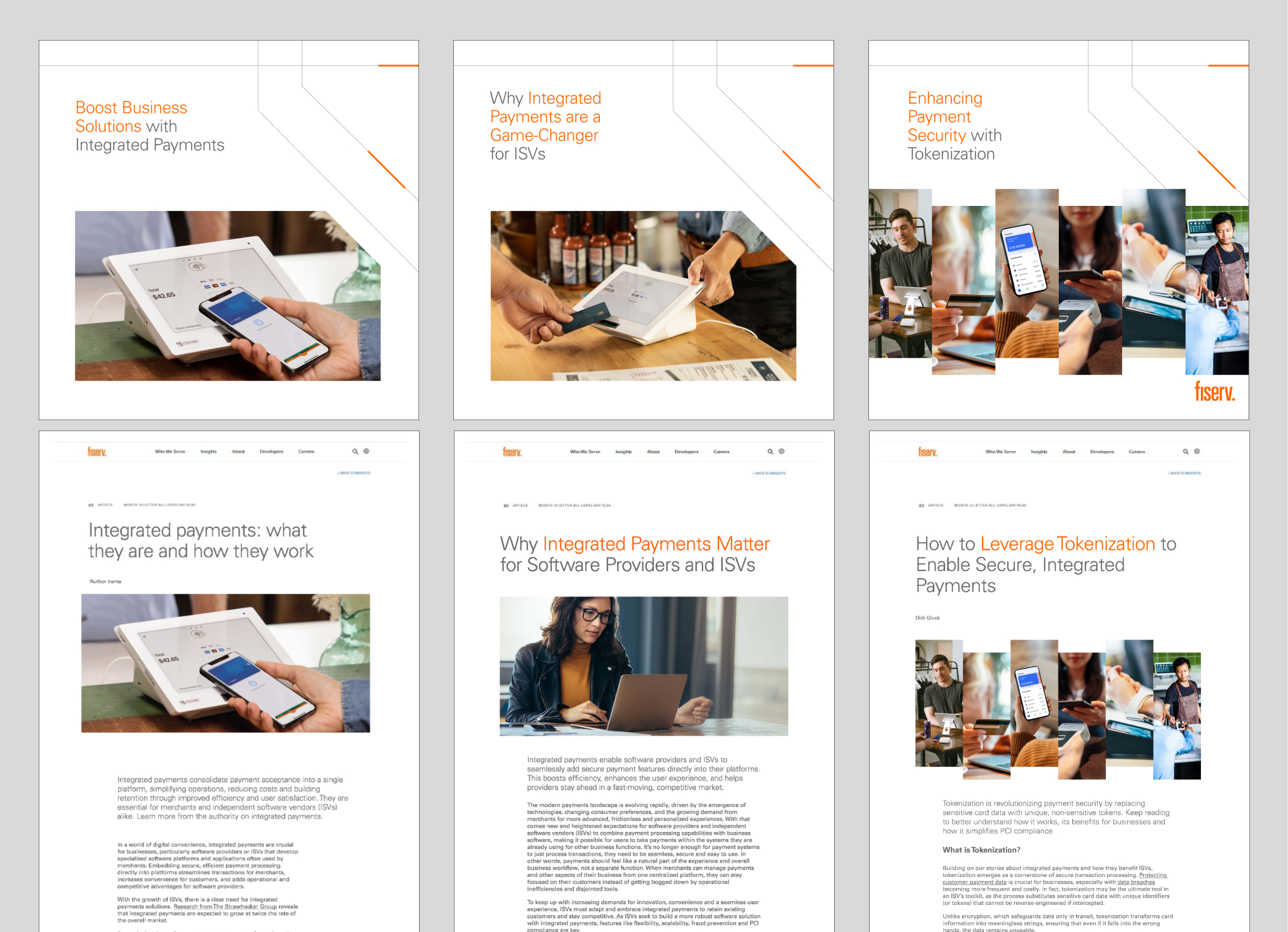
Manifest swooped in and worked side-by-side with their internal team to restructure content, design more dynamic page layouts within existing site constraints and create new image assets that spoke to their target in a way that truly showed why Fiserv was the best solution for their digital payment needs.

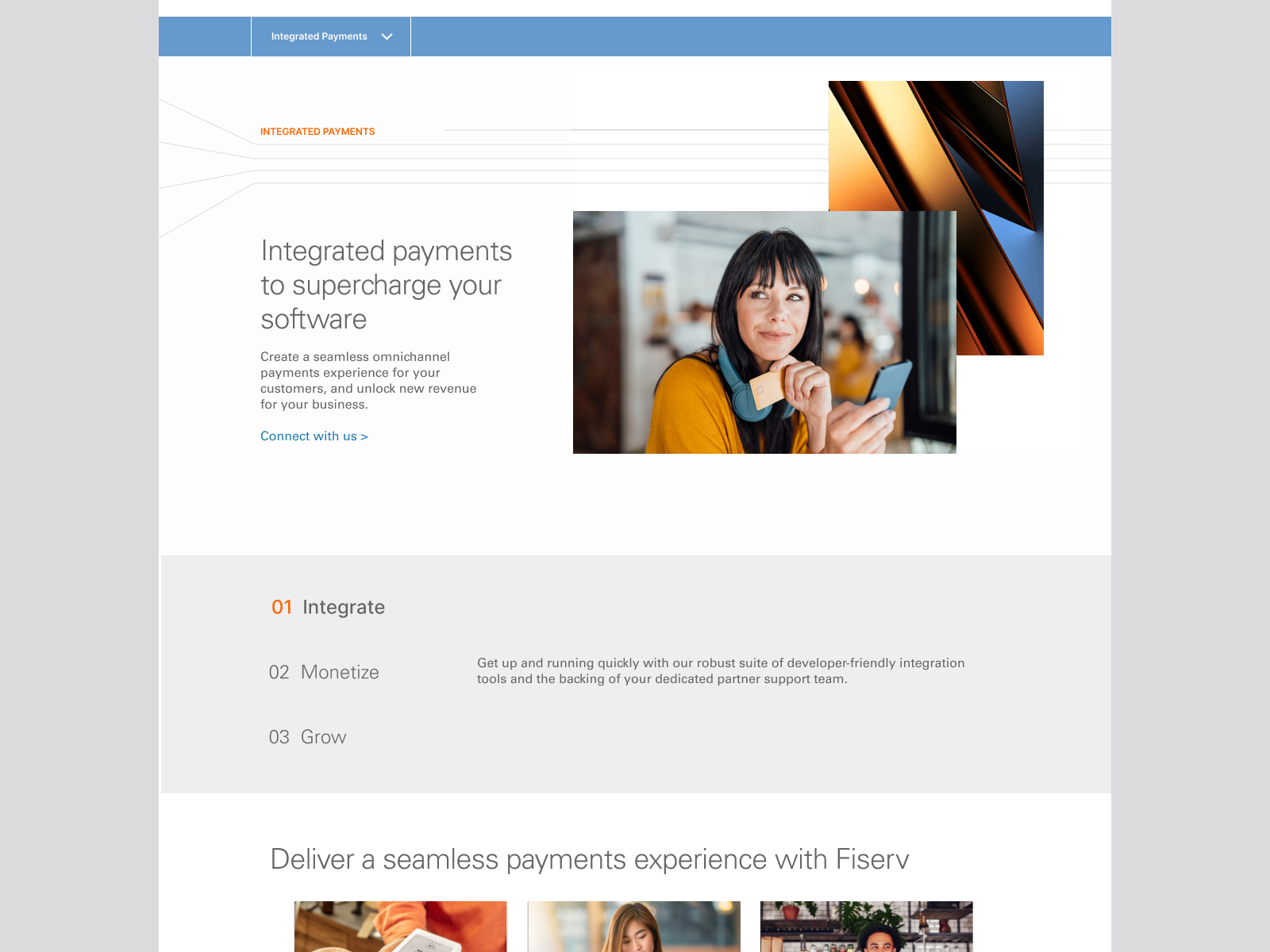
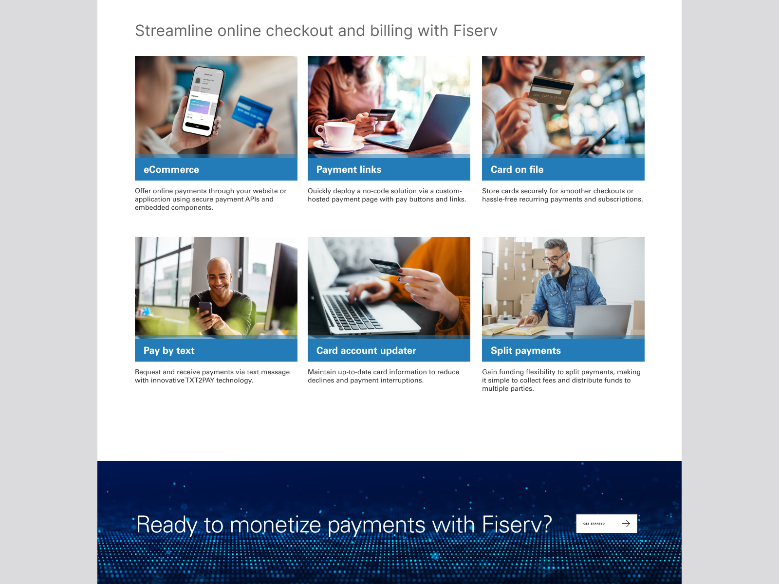
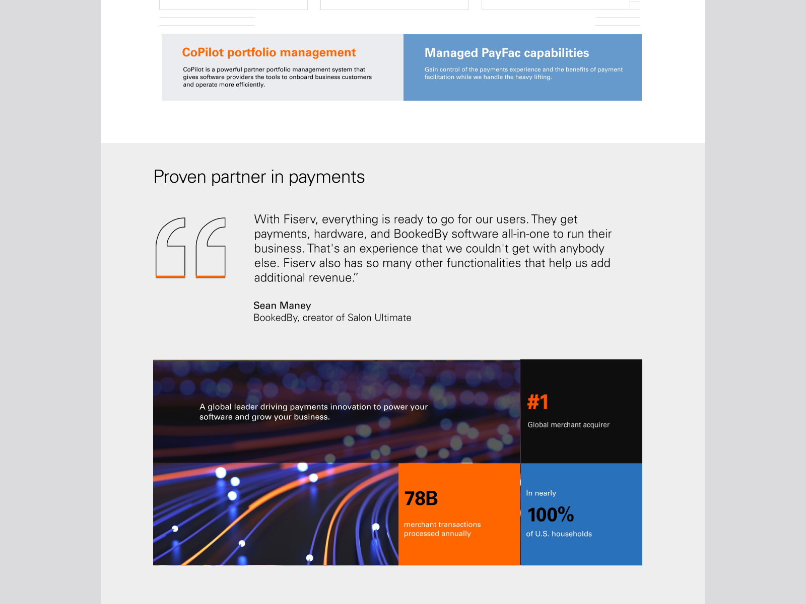
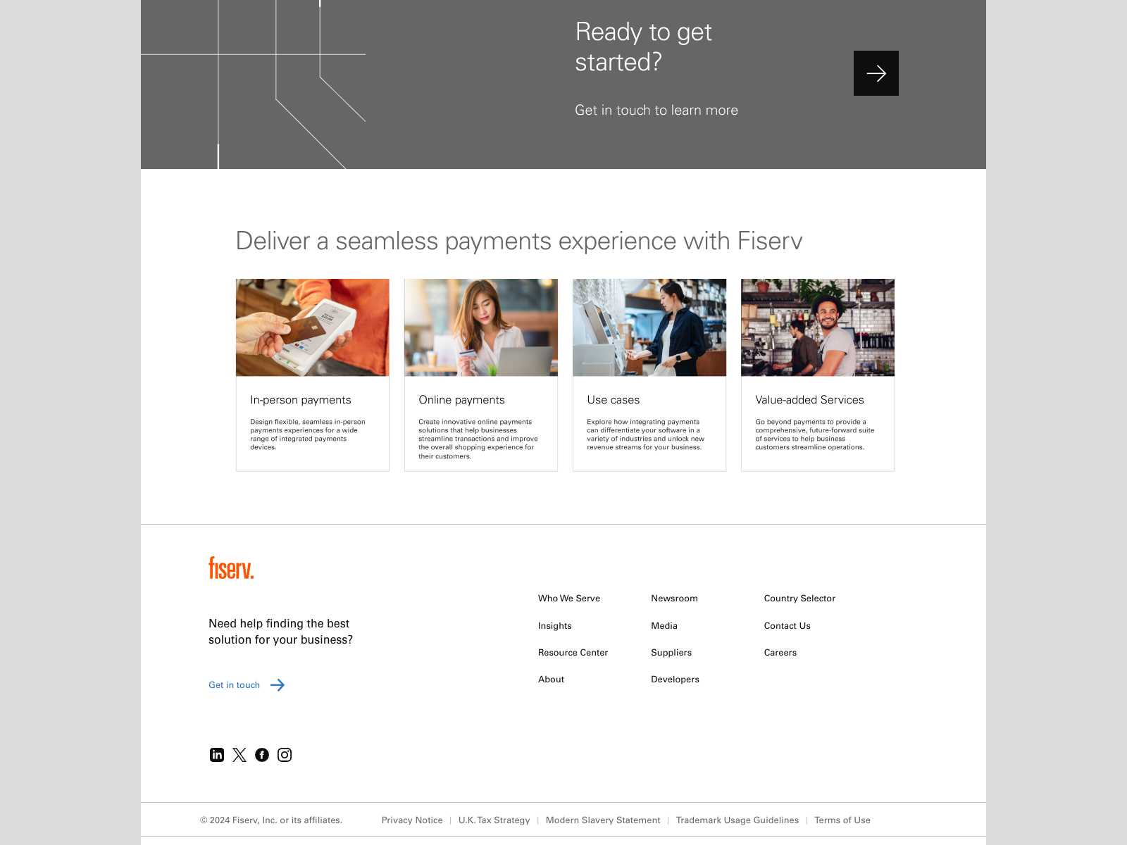
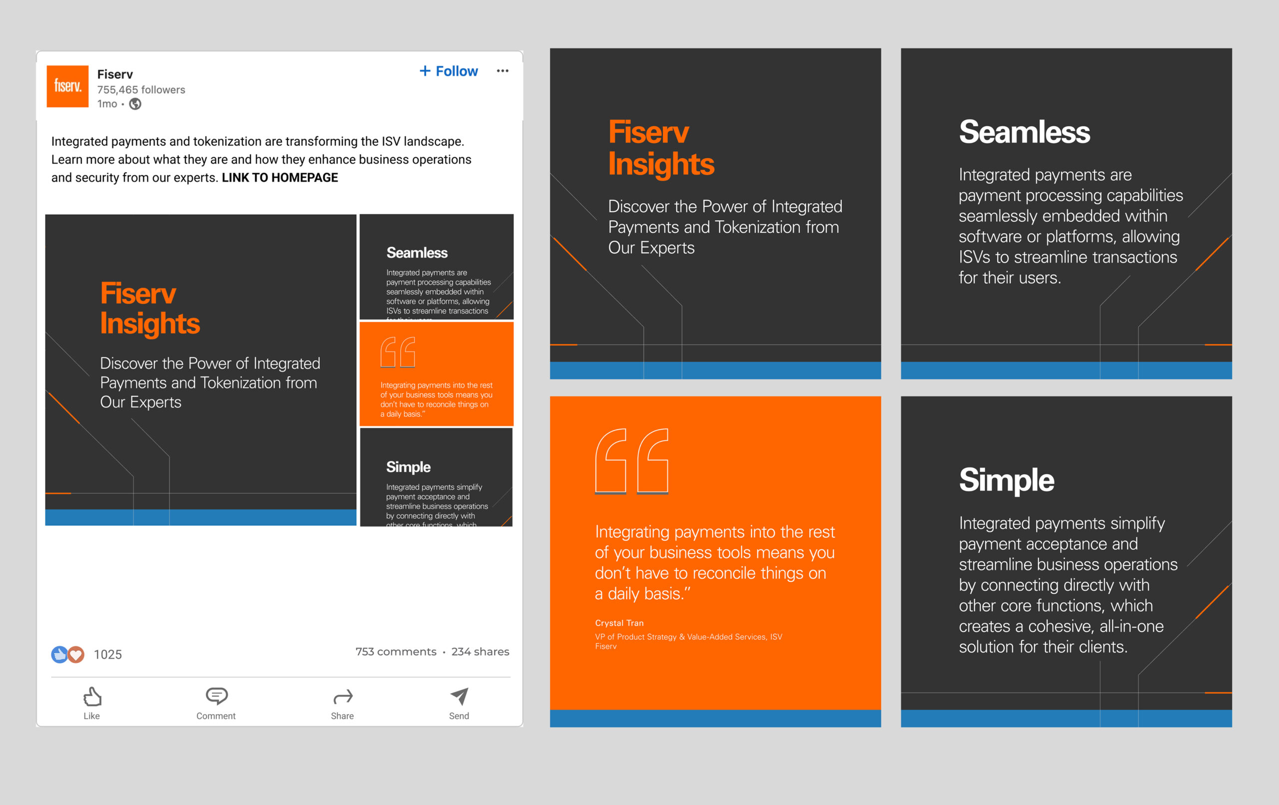
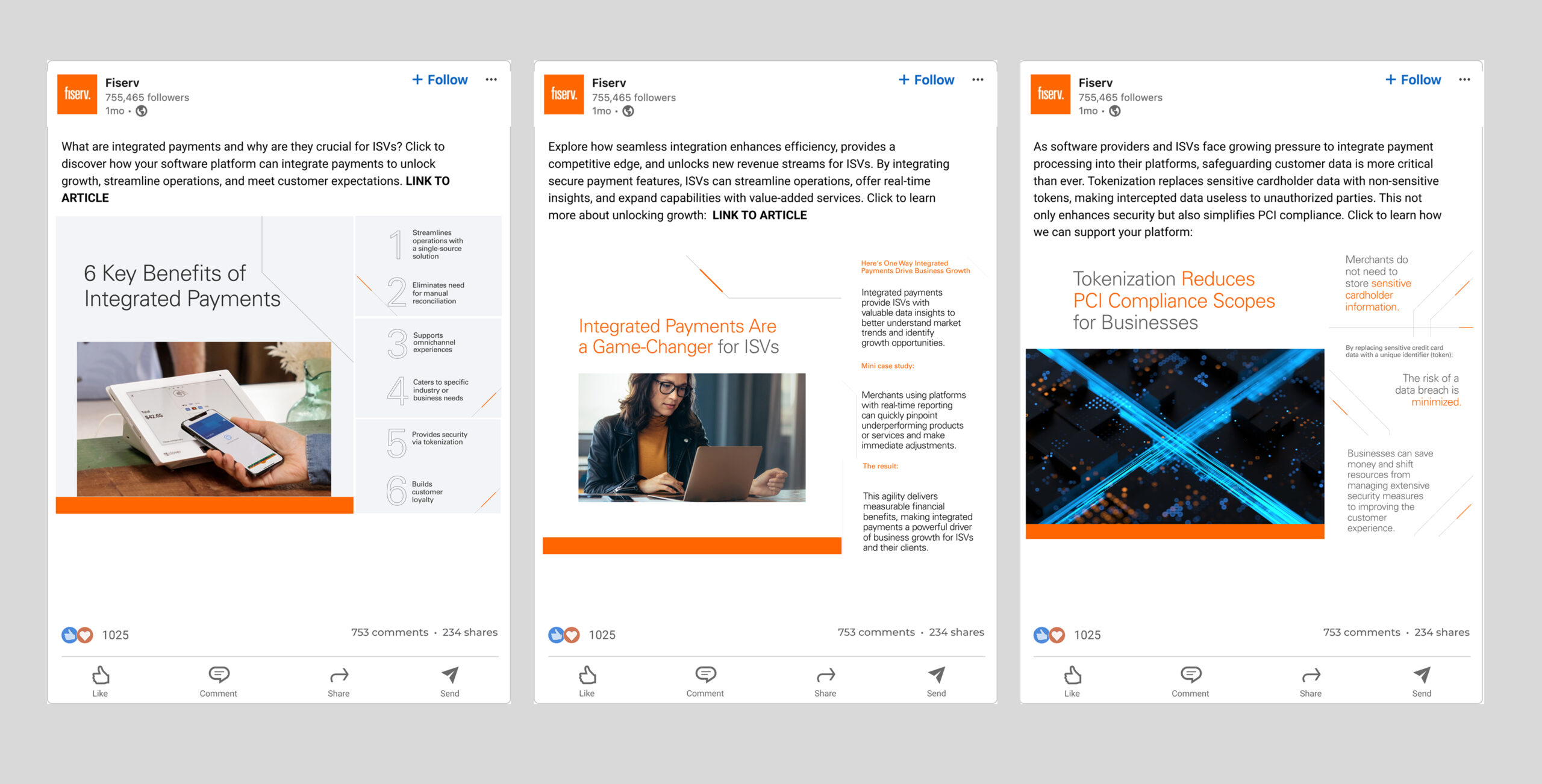
Mixing bold design blocks with just the right amount of distilled information beckons our audience to keep exploring the site.

Web Design
The formula for each page consists of an introduction header, 3 main points of focus, and then corresponding modules where used to go into further detail on each topic. Double click on the images below to see each page full size.
01_New Homepage Design v1
ISV Homepage Design
02_Online Payments Design v1
Online Payments Design
03_In-Person Payments New Design
In-Person Payments Design
04_Use Cases Design v1
Use Cases Design
05_Value-Added Design v1
Value Add Design
06_Partner Support design v1
Partner Support Design
User Experience Redesign
The current site wasn't seeing the click-throughs to subsequent pages so the client asked us to redesign the microsite in a way that presented the information more intuitatively. Working within the constraints of existing components, we edited, refined and made new sections for a much improved experience.
01_uxui_home
Homepage UI/UX
02_uxui_onlinepay
Online Pay UI/UX
03_uxui_inperson-payments
In-Person Payments UI/UX
04_uxui_partner-support
Partner Support UI/UX
05_uxui_use-cases
Use Cases UI/UX
06_uxui_value-add
Value Add UI/UX
Working Smarter with Components
Structuring each page to work with components is common sense, but making sure each component can do enough heavy-lifting is another story. Each component needed to tell a story within each picture. I created the proper scenarios to display each Fiserv product thriving, without needing to actually photograph any real world shots. I ensured just the right amount of words accompanied each image for product differeniation without cluttering the overall layout.
components-scratch
scratch board
03_device carousel
Device Carousel
Screenshot 2025-09-23 at 1.48.43 PM
Figma Components

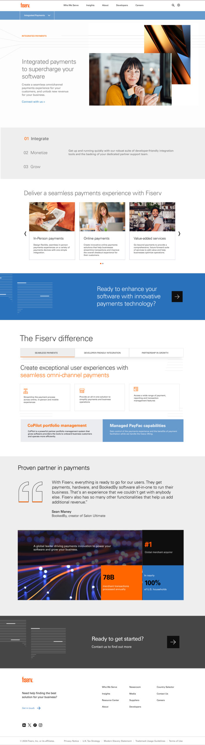
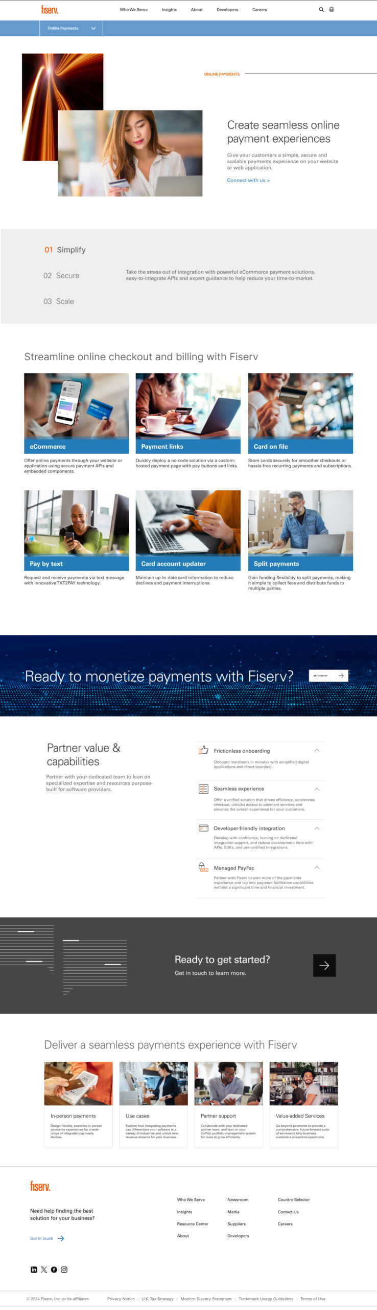
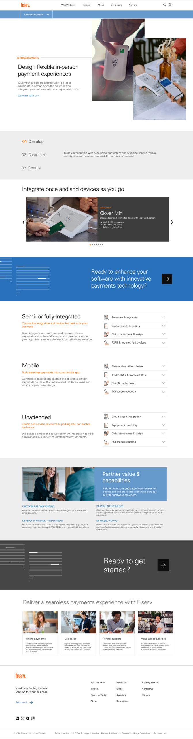
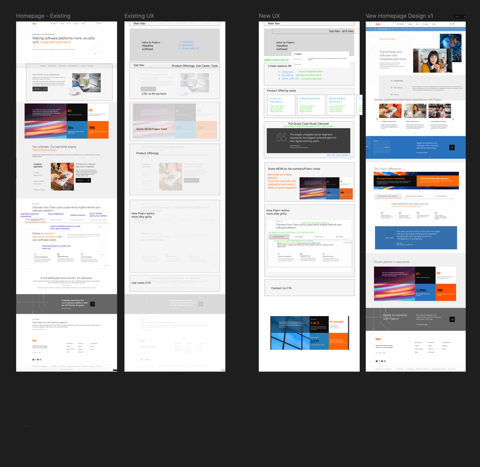
Our Fiserv client was thrilled with how quickly we were able to pick up their brand, embrace their existing constraints, build something that felt fresh and executed within the rushed timeline.

Linking In Social Support
To help drive traffic to the new online articles, we leveraged LinkedIn's multi-image post to start the education process and help Fiserv claim authority in the payment system space.
Platform-first Thought Leadership
To cater to the social gods, we created posts that educated our audience with bite-sized information. The strategy of this type of post allows our viewers to learn something, even if they never click through to the articles.
Social Teasers
We created some posts that just teased articles as well.

My role:

site design
UI design curation
UX redesign
art direction  
retouching

Deliverables:

ISV microsite

blog articles

LinkedIn posts

Company Credits:

Manifest editorial team
Manifest strategy team
Manifest data analytics

Selected Works

FiservCorporate B2B Design
The IQSports Education
Go PapertarianConsumer Behavior Change Campaign