Oncology Solutions

by GE Healthcare

How do you get oncologists and hospitals to consider investing in decade long commitments for machines that cost tens of thousands of dollars?

By showing them you understand their pain points along the care pathway and that you can offer them solutions that result in real differences in health outcomes at each phase.

GE tasked us with creating an online experience that would help people understand the various challenges at each stage of the oncology care pathway and how the solutions they design are bridging the gap between science and care.

We designed an unconventional healthcare experience that engaged our audiences to explore GE solutions in a compelling way.

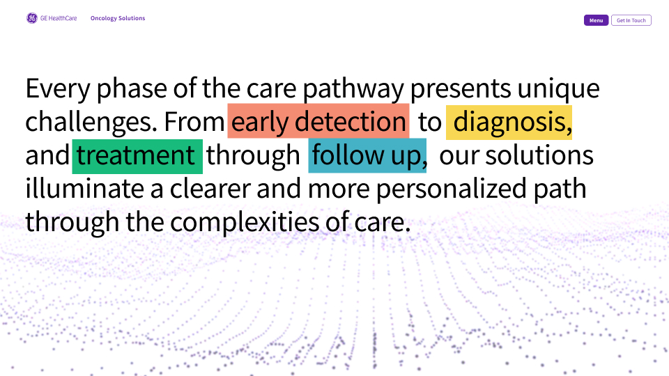
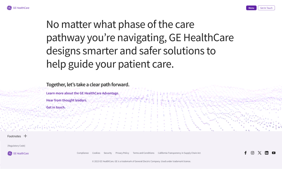
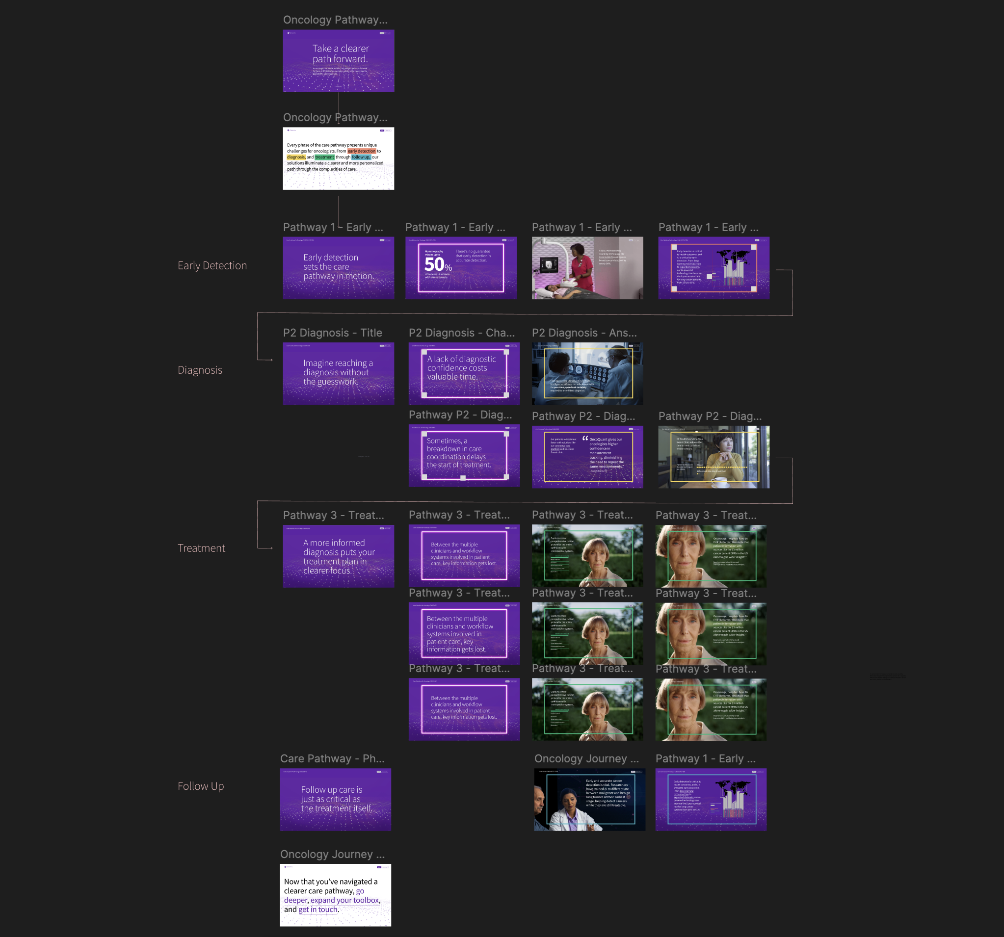
Every phase of the care pathway presents unique challenges. From early detection to diagnosis, and treatment through follow-up, we show how GE solutions illuminate a clearer and more personalized path through the complexities of care.

Human Focused

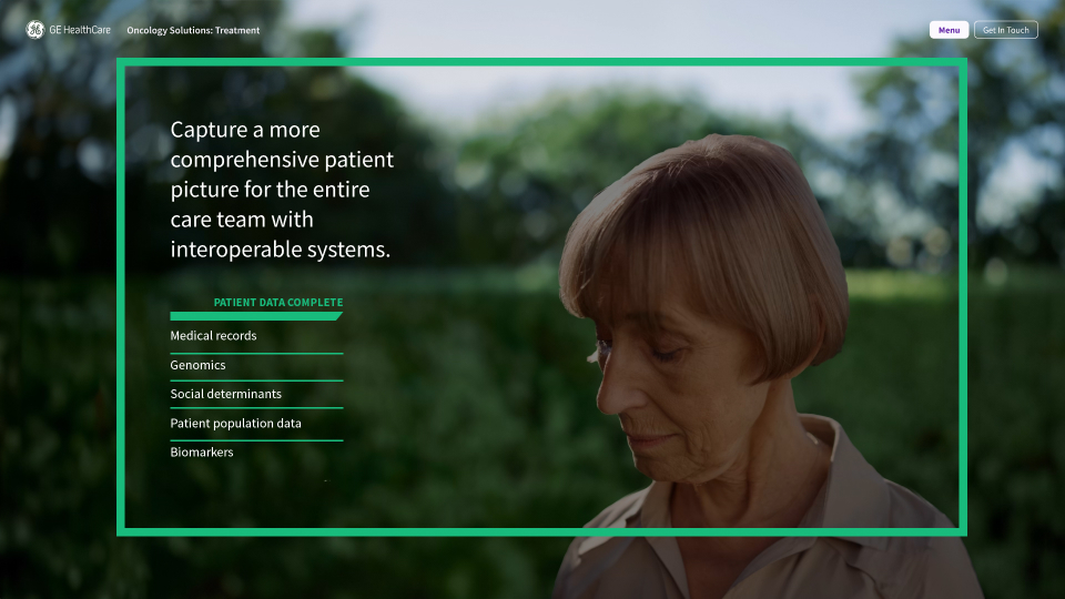
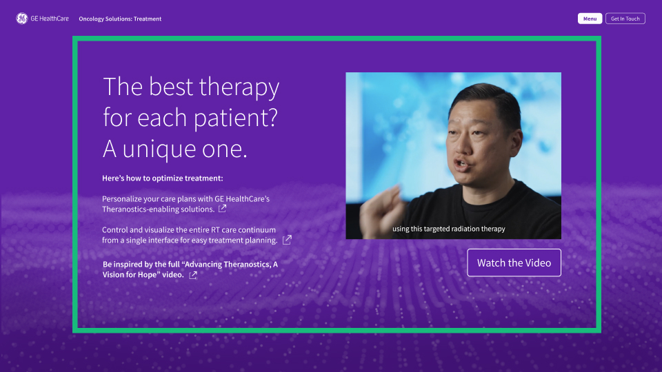
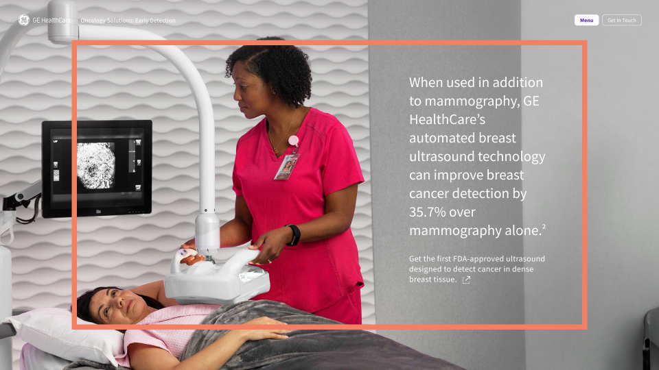
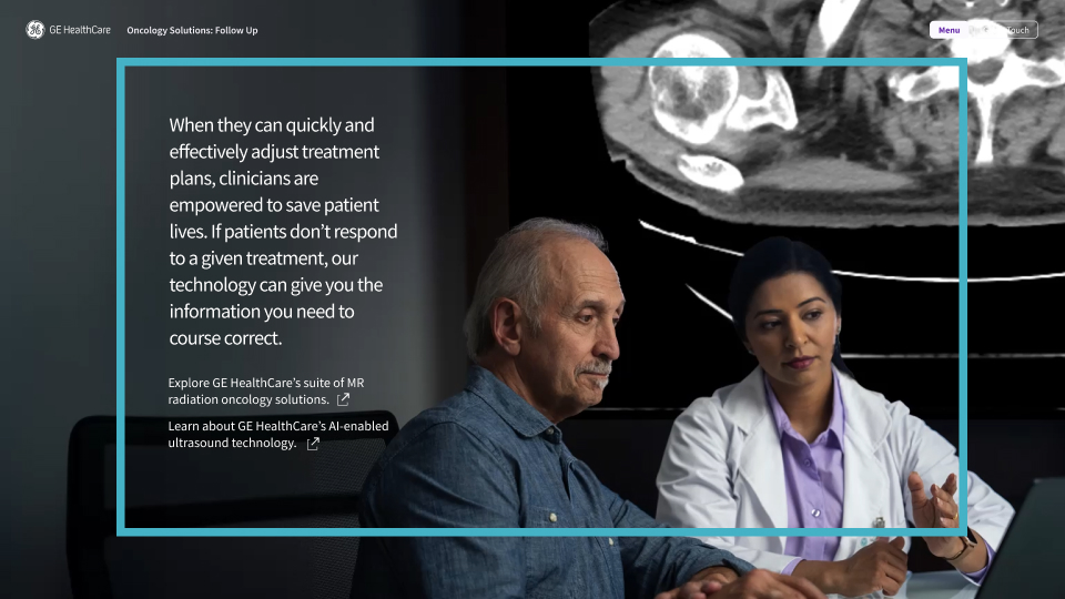
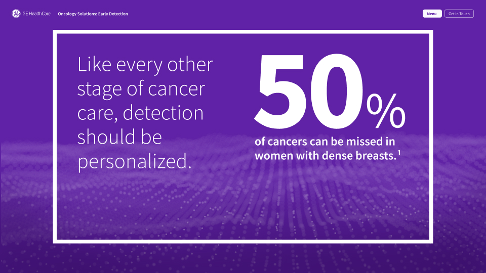
While it's easy to put forth data and facts, keeping visuals tied to humanity is a big part of the GE Healthcare brand. We designed powerful, people-focused custom video for each stage to ensure those at the heart of the treatment are front and center.
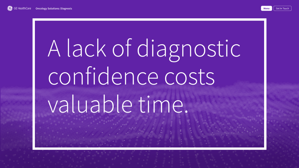
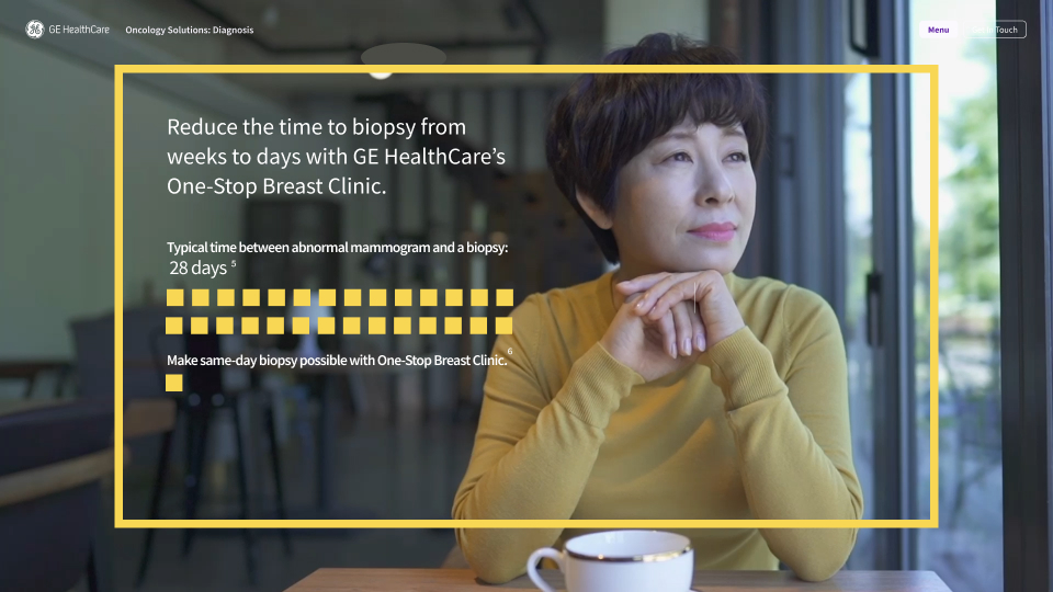
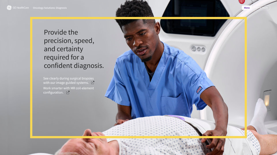
2.1_P2 Diagnosis – Challenge 1
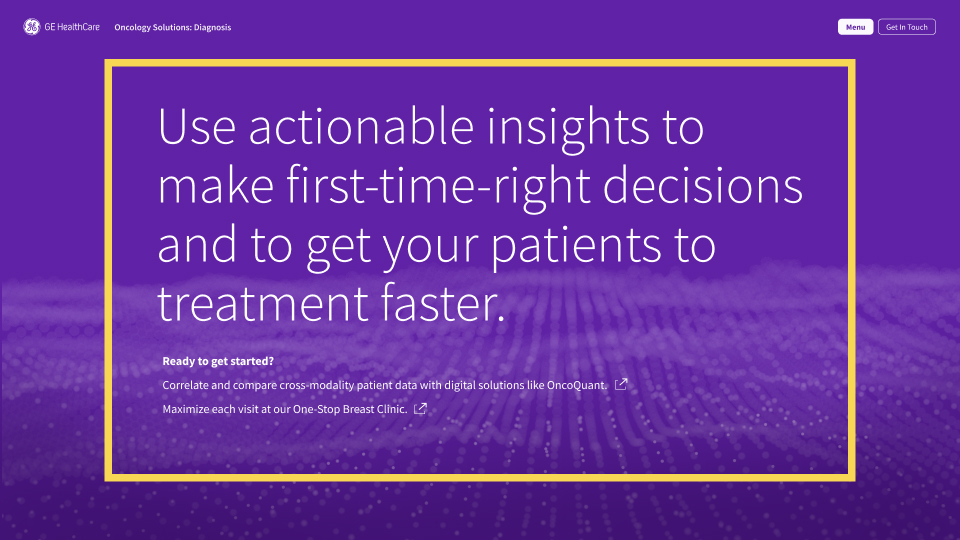
2.5_P2 Diagnosis – Answer 2b
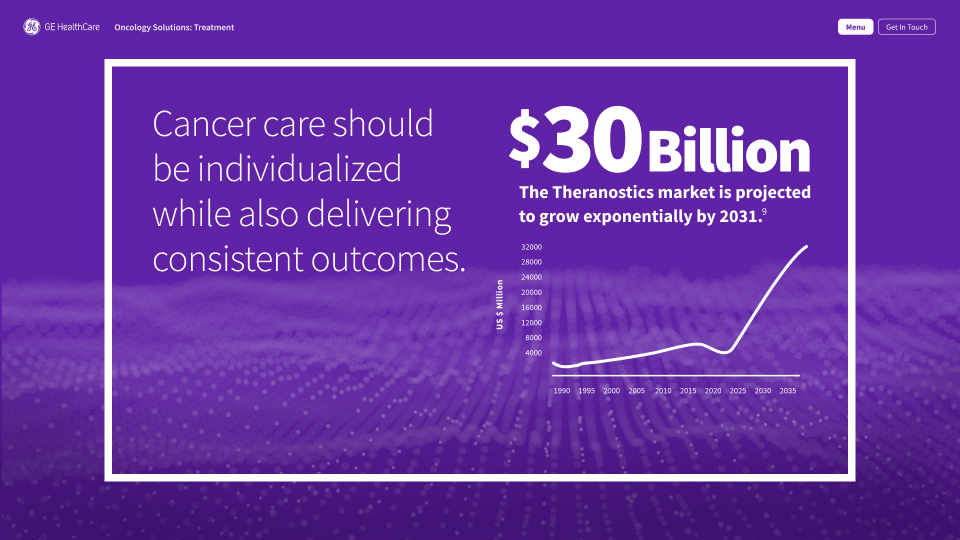
3.2_P3 Treatment – Answer 1a
3.6_P3 Treatment – Answer 2a
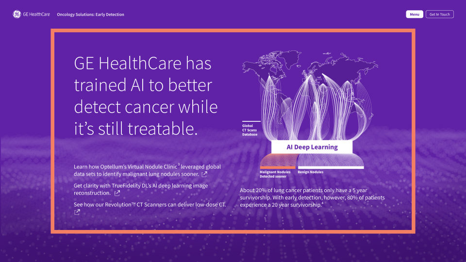
1.2_P1 Early Detection – Answer 1a
4.3_P4 Follow Up – Answer 1a
Design Concept
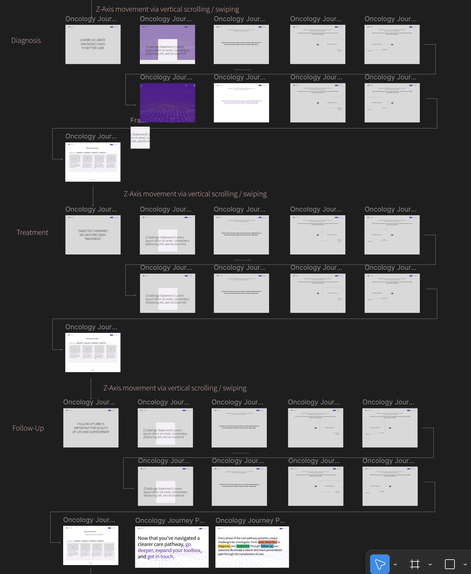
Unconventional experience for a healthcare website, GE embraced the idea of using the Z-axis to visualize forging ahead through a care pathway. As the user scrolls through an abstract sea of floating datapoints, the vital moments of each phase are brought forth, guiding their journey.

Structured in a Challenge/Solution format, we dove deep into the research to unearth moments that resonate with today’s circumstances to highlight the opportunities for improvement.
Solutions Page
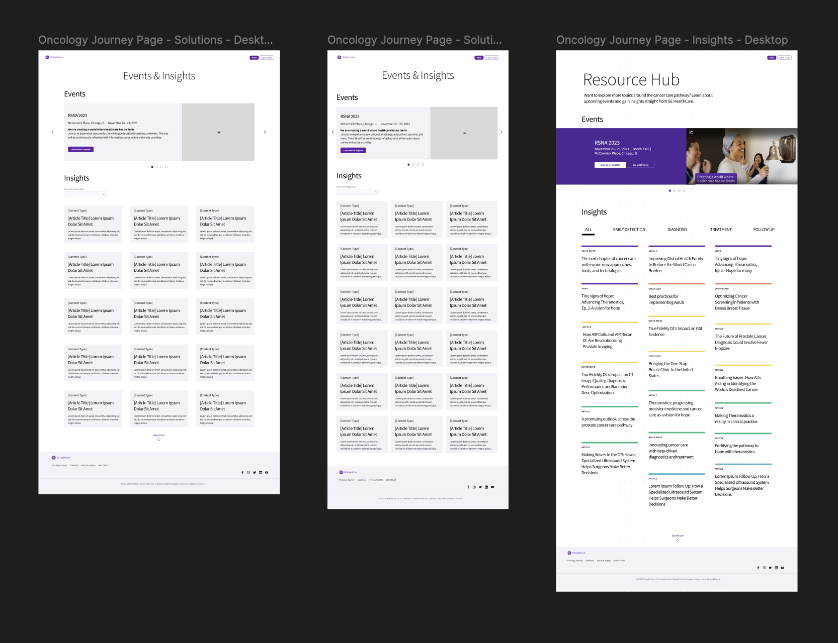
The Solutions page was designed to reflect GE Heathcare's authority (Our Advantage) in various areas of oncology and showcase the wide range of products and solutions that could be filtered by type of oncology need and care pathway phase.
Insights & Events
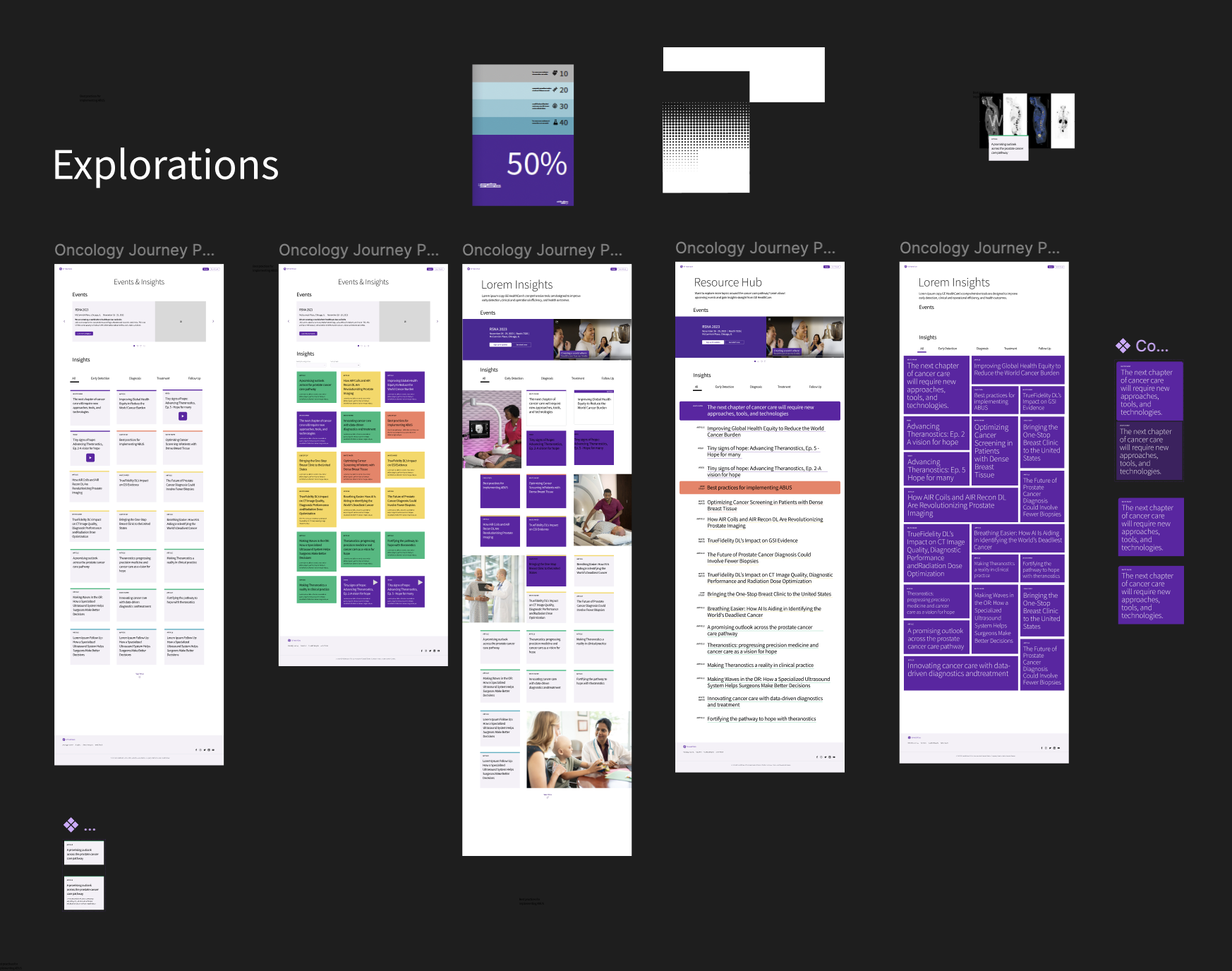
Oncology Insights page showcased GE Healthcare's thought leadership and shared meaningful research articles and videos. This was also designed to be filtered by content type and care pathway phase for quick access to the most relevant information. 
UX/Flow
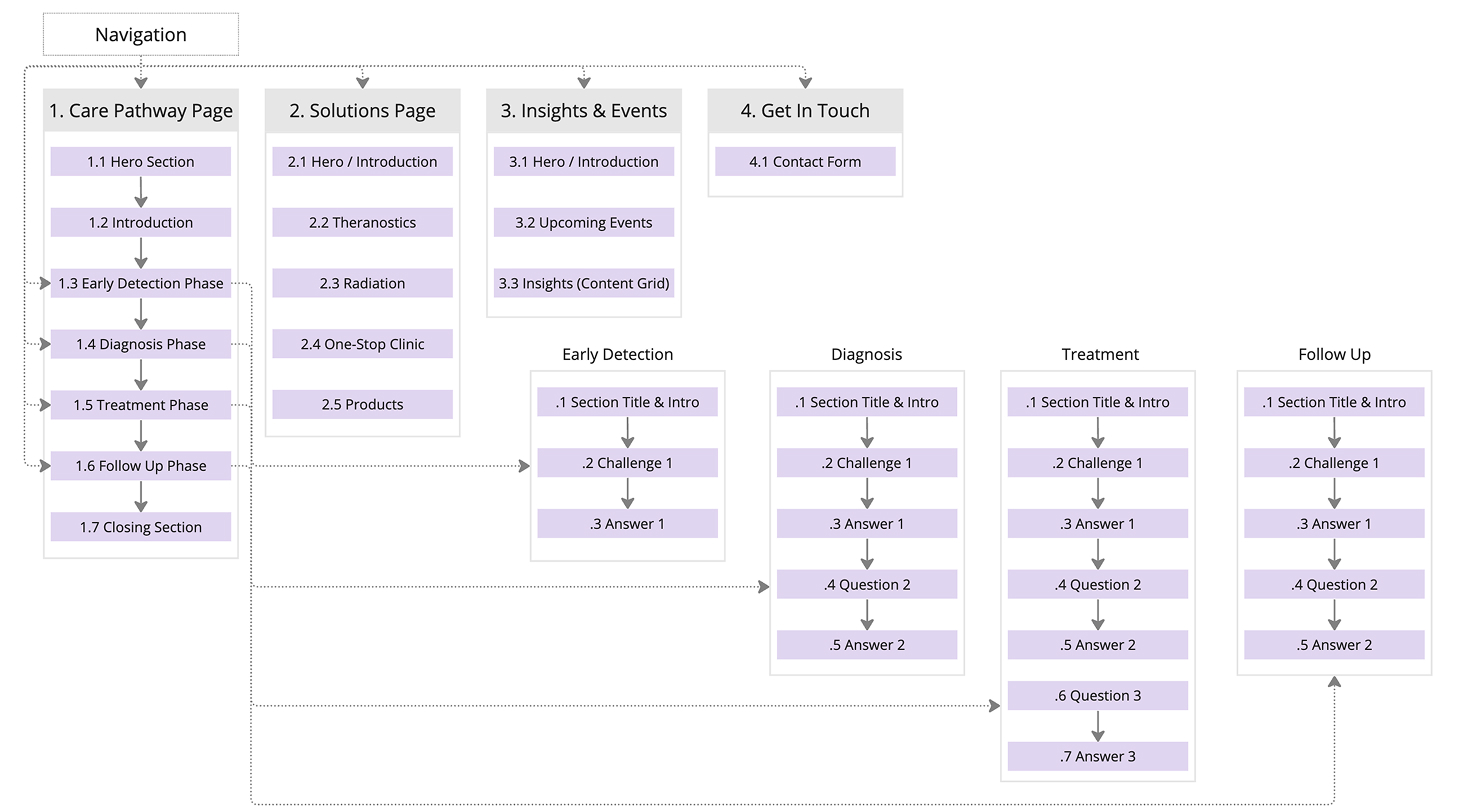
Structured in a Challenge/Solution format, we dove deep into the research to unearth moments that resonate with today’s circumstances to highlight the opportunities for improvement.
UI Design
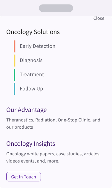
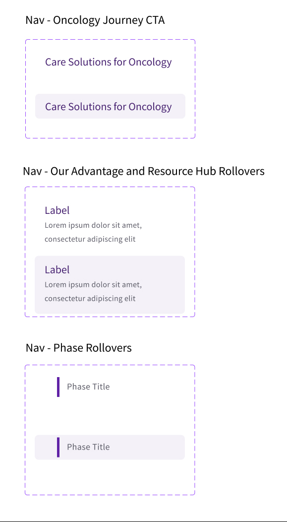
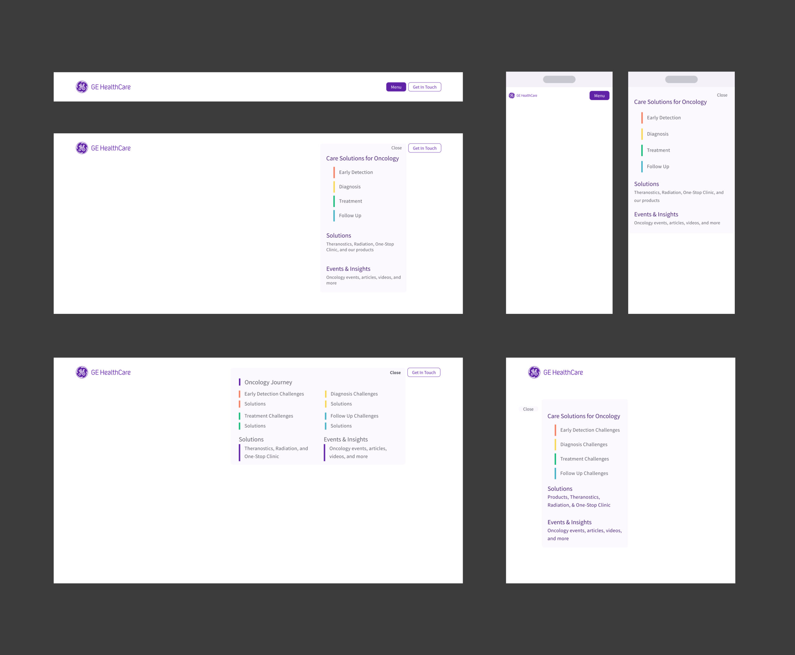
Various navigation designs were explored to ensure the content would be well-organized and the correct emphasis would be portrayed for each section. While the hope would be that our audience would explore the care pathway in one seamless moment, we also recognized the need for some to jump to specific sections that were more meaningful to them.
Process
To create a unique and memorable experience but remain rooted in more traditional healthcare websites, we designed the primary section of the site to move through a z-axis of information and reserved a section of the site to host more traditional pages for articles and resources. The unconventional choice to use forward motion through space worked well to reflect the concept of navigating through a sea of information to take the right path.
UX Z-axis Scrolling Wires
UI_journey flow
UI Journey Flow
UX_resource-hub_explorations
UX Resources Explorations
UX_articles-insights_exploration
UX Articles Exploration
Color Coding Design Systems
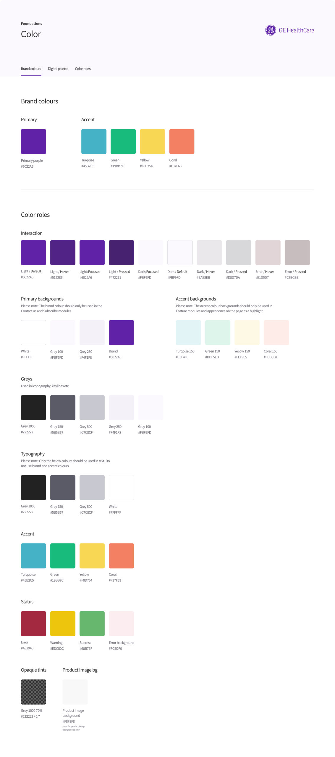
To create a design system that would help users navigate the care pathway and also be applicable to care pathways outside of oncology for future experiences, we leveraged the brand's accent colors to visually represent each of the 4 phases of the care pathway. These colors were then used to highlight phase-specific content and as wayfinding elements throughout the site. 
Journey Navigation Color
Navigation Color Coding
4 color
Care Pathway Color Coding
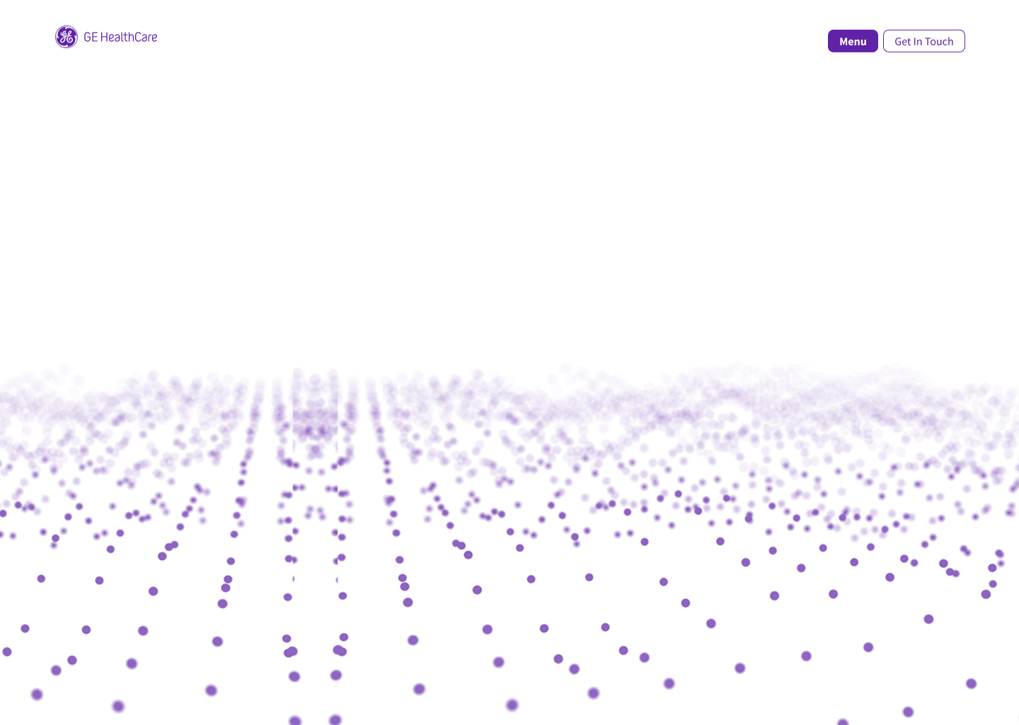
Oncology Pathway Page Hero
Oncology Pathway Landing Page
Brand Colors
Brand Colors
Navigation Components
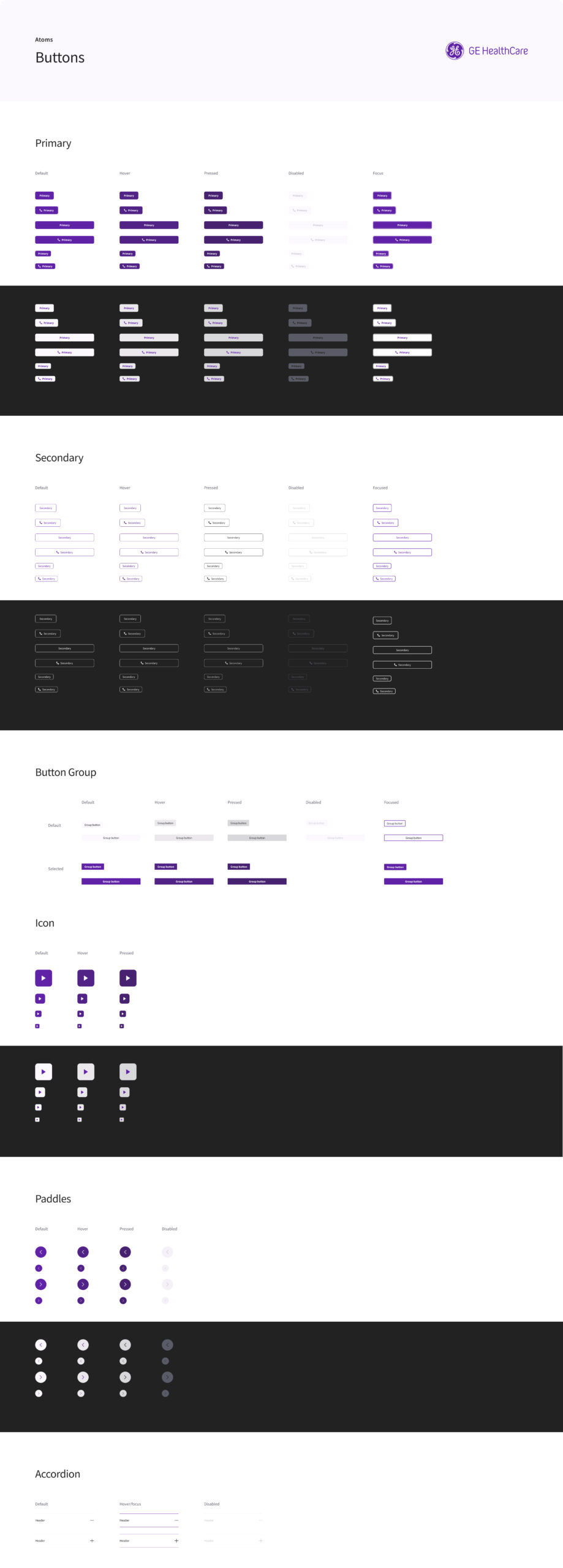
Buttons
Buttons
Intro Panel
Intro Panel Inverse Transition
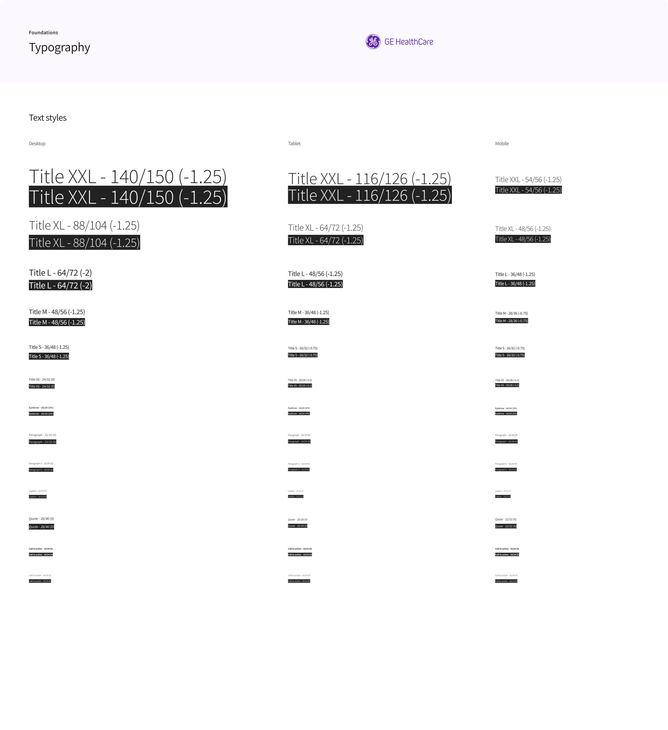
Typography
Typography
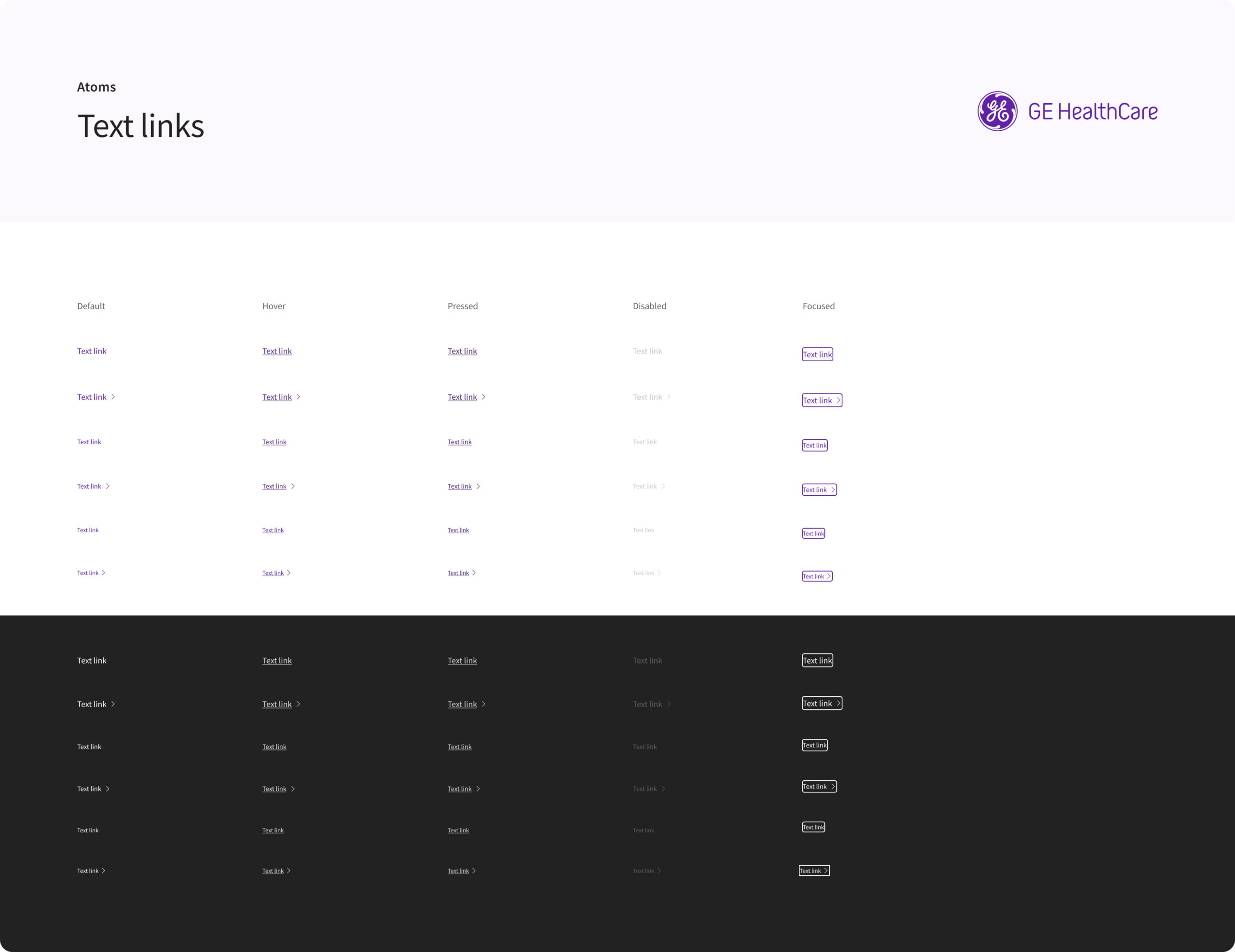
Text links
Text Links

The result ended up being a standout site that beckons to empower you with the right balance of science & care with GE Healthcare.

My Role:

art direction  
site design
UI design
UX design
motion design

Deliverables:

oncology microsite 
resource hub
competitive tools page
product solutions page

Company Credits:

Manifest creative team
Manifest editorial team
Manifest strategy team
Manifest data analytics

Selected Works

Go PapertarianConsumer Behavior Change Campaign
Creative Pushups @ SXSWExperiential Design
Joie De VivreExperiential Design
FiservCorporate B2B Design
The IQSports Education

©2025 Kristen Youngman. All rights reserved.